Statistical graphics
Invalid Date
This week: data visualization
- Uses of data visualization
- Exploration
- Presentation
- Statistical graphics
- Graphical elements: axes, geometric objects, aesthetic attributes, and text
- Building graphics: mapping data to graphical elements
- Survey of common graphics
- one- and two-variable displays
- Principles of effective visualization
- Effective uses of aesthetics and layout
- Common blunders
Figure credits
Many of the figures from this week’s slides are from Claus Wilke’s Fundamentals of Data Visualization.
Notice your reaction
This is great for a paper or technical report, but it takes effort to discern patterns; I’d much rather see a few plots, like achievement vs. year by grade and gender.
Uses of graphics
There is a broad distinction between:
- exploratory graphics, which are intended to be seen only by analysts; and
- presentation graphics, which are intended to be seen by an audience.
Exploratory graphics are made quickly in large volumes, and usually not formatted too carefully. Think of them like the pages of a sketchbook.
Presentation graphics are made slowly with great attention to detail. Think of them as exhibition artworks.
The two are not mutually exclusive: an especially helpful exploratory graphic is often worth developing as a presentation graphic to help an audience understand ‘what the data look like’.
Elements of statistical graphics
Statistical graphics are actually quite simple. They consist of the following four elements:
- Axes
- References for all other graphical elements.
- Geometric objects
- Points, lines, curves, filled regions, etc.
- Aesthetic attributes
- Color, shape, size, opacity/transparency.
- Text
- Labels, legends, and titles.
Axes
We are all familiar with axes. The word axis literally means axle: an axis is an object that other things turn around.
In statistical graphics, axes establish positional references for locating any geometric object – line, point, polygon – on the graphic.
Geometric objects
Geometric objects are the things depicted on a plot, whatever those may be; typically points, lines, polygons, and shapes.
Aesthetic attributes
For us, aesthetics will mean qualities of geometric objects, like color or transparency.
Primary aesthetics in statistical graphics are:
- Shape (for points)
- Color
- Size
- Opacity/transparency
Text
Text is used to label axes, objects, legends, and specify titles.
Text may seem innocuous, but it is what creates story – text gives a plot its plot!
Statistical graphics are mappings
Statistical graphics are mappings of dataframe columns and attributes to graphical elements: axes, geometric objects, and aesthetic attributes.
For a simple example, consider the following time series of Cuba’s population by year:
Mappings:
- population \(\longrightarrow\) y coordinate of axis;
- year \(\longrightarrow\) x coordinate of axis;
- observations \(\longrightarrow\) line
Mapping columns to aesthetics
Now consider aggregated populations by global region and year:
Mappings:
- population \(\longrightarrow\) y
- year \(\longrightarrow\) x
- region \(\longrightarrow\) color
- observations \(\longrightarrow\) line (groupwise by color)
Using aesthetics
The ability to map variables to the elements of a graphic is essential because it means we can display more than two variables at a time by leveraging aesthetic attributes.
For example, in lab you’ll begin with this scatterplot:
Each point represents a country in a particular year. The graphic shows that life expectancy increases with GDP per capita.
Using aesthetics
In the lab you’ll add aesthetic mappings step by step until arriving at this plot:
This figure displays the same x-y relationship as before, but together with time, continental region, and population.
Verges on too complex.
Using graphics for discovery
Further incorporating sex shows that GDP per capita is associated with differential life expectancy gaps between men and women:
In other words, on average women outlive men by longer in wealtheir countries.
- Maybe just by an additional 2-3 years in wealthier countries
- Clear pattern but lots of variation for a given GDP/capita
Altair
Altair, a python library, creates graphics exactly as described above: mapping columns of a dataframe to graphical elements.
It has a somewhat idiosyncratic syntactical pattern involving a “chart”, “marks”, and “encodings”:
| Altair syntax | Example handle | Operation |
|---|---|---|
| Chart | alt.Chart(df) |
Coerces a dataframe df to a chart object |
| Mark | mark_point() |
Specifies a geometric object |
| Encoding | encode(x = ..., y = ..., color = ...) |
Maps columns of df to objects and aesthetics |
Basic use of syntax
A chart specification, mark(s), and encodings are chained together to make a graphic.
Choice of scale
The choice of scales for each mapping can either reveal or obscure patterns in data.
When population is mapped onto a logarithmic rather than linear scale, rates of increase become evident in less populous regions:
Code
alt.Chart(
    popregion
).mark_line(
).encode(
    x = 'Year:T',
    y = alt.Y('Population', scale = alt.Scale(type = 'log')), # change axis scale
    color = 'Region'
).properties(
    width = 350, height = 100
).configure_axis(
    labelFontSize = 16, titleFontSize = 16
).configure_legend(
    labelFontSize = 16, titleFontSize = 16
)
Note: scale is adjusted at the encoding level by alt.Y(...); every encoding channel has an analogous function, e.g., alt.X(...), alt.Color(...), alt.Shape(...), etc., with optional scale arguments.
Common statistical graphics
Broadly, the most common statistical graphics can be divided according to the number of variables that form their primary display. The uses listed below are not exclusive, just some of the most common.
One-variable graphics are used to visualize distributions.
Two-variable graphics are used to visualize relationships.
Three-variable graphics are used to visualize spatial data, matrices, and a collection of other data types.
Most graphics you’ll encounter are grouped one- or two-variable graphics with superpositions of geometric objects differentiating observed from inferred values – e.g., scatterplots with points color-coded by another (grouping) variable and trend lines.
Single-variable graphics
Single-variable graphics usually display the distribution of values of a single variable.

Histograms and smoothed density plots show shape but depend on arbitrary binning/smoothing parameters.
CDF and quantile plots show the distribution exactly but are harder to interpret.
Histograms
Histograms show the relative frequencies of values of a single variable.
Code
alt.Chart(
    popcountry.loc["1970"]
).mark_bar().encode(
    x = alt.X('log(Population)',
            bin = alt.Bin(maxbins = 50)),
    y = 'count()'
).properties(
    height = 150,
    title = 'National populations in 1970'
).properties(
    width = 500, height = 300
).configure_axis(
    labelFontSize = 16, titleFontSize = 16
).configure_legend(
    labelFontSize = 16, titleFontSize = 16
).configure_title(
    fontSize = 16
)
The main advantage of the histogram is it shows the shape of a distribution.
Bin widths
The main downside is that the shape depends on bin width, which is an arbitrary parameter.
Code
alt.Chart(
    popcountry.loc["1970"]
).mark_bar().encode(
    x = alt.X('log(Population)',
            bin = alt.Bin(maxbins = 10)),
    y = 'count()'
).properties(
    height = 150,
    title = 'National populations in 1970'
).properties(
    width = 350, height = 100
).configure_axis(
    labelFontSize = 16, titleFontSize = 16
).configure_legend(
    labelFontSize = 16, titleFontSize = 16
).configure_title(
    fontSize = 16
)
Code
alt.Chart(
    popcountry.loc["1970"]
).mark_bar().encode(
    x = alt.X('log(Population)',
            bin = alt.Bin(maxbins = 50)),
    y = 'count()'
).properties(
    height = 150,
    title = 'National populations in 1970'
).properties(
    width = 350, height = 100
).configure_axis(
    labelFontSize = 16, titleFontSize = 16
).configure_legend(
    labelFontSize = 16, titleFontSize = 16
).configure_title(
    fontSize = 16
)
Always experiment with multiple bin widths to ensure you don’t overlook any important details such as outliers, multiple modes, etc.
- Binning at left is too coarse, obscures outlying values
- Binning at right is good
Density plots
Denisty plots are smoothed histograms – we’ll discuss further next week. They also require some arbitrary choices that affect the appearance.
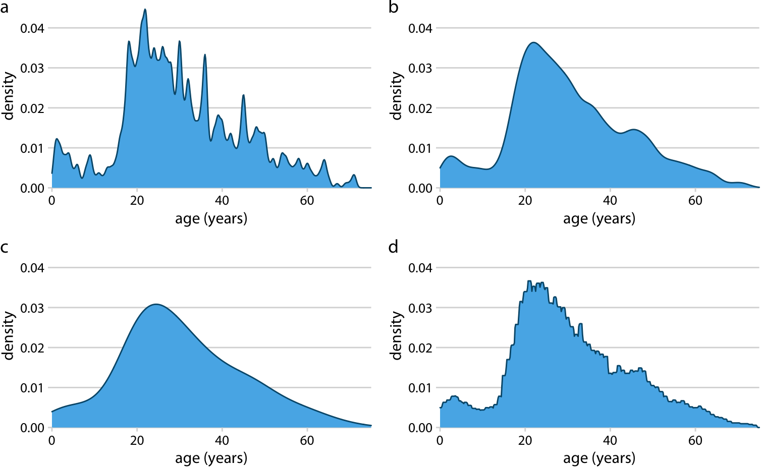
Density plots with different smoothing kernels and bandwidths
More single-variable graphics
Grouped single-variable graphics allow visualization of multiple distributions.
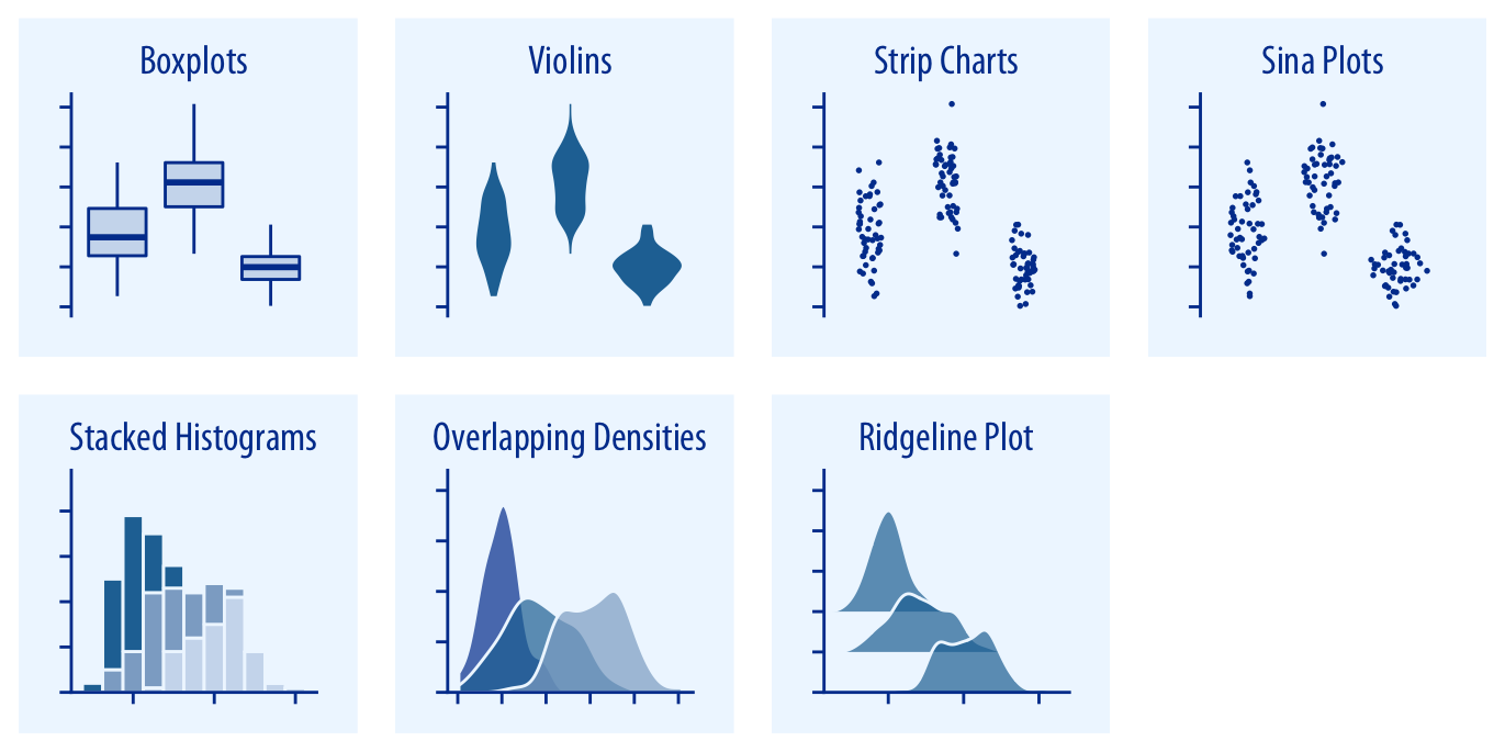
Boxplots
Boxplots display data quantiles and outliers, conveying skewness and range.
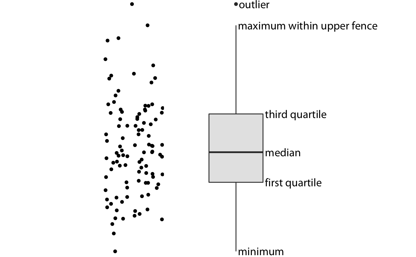
Due to their compactness, they are useful for comparing multiple distributions.
Many boxplots
Single-variable graphics are not necessarily limited to univariate data; one might want to compare distributions using the same single-variable displays shown groupwise.
Code
alt.Chart(
    popcountry.reset_index()
).mark_boxplot(
    outliers = True, size = 7
).encode(
    x = 'Year:T',
    y = alt.Y('Population', scale = alt.Scale(type = 'log'))
).properties(
    width = 600
).configure_axis(
    labelFontSize = 16, titleFontSize = 16
).configure_legend(
    labelFontSize = 16, titleFontSize = 16
).configure_title(
    fontSize = 16
)
Multiple histograms
Histograms aren’t well-suited to comparing distributions. Do not stack histograms.
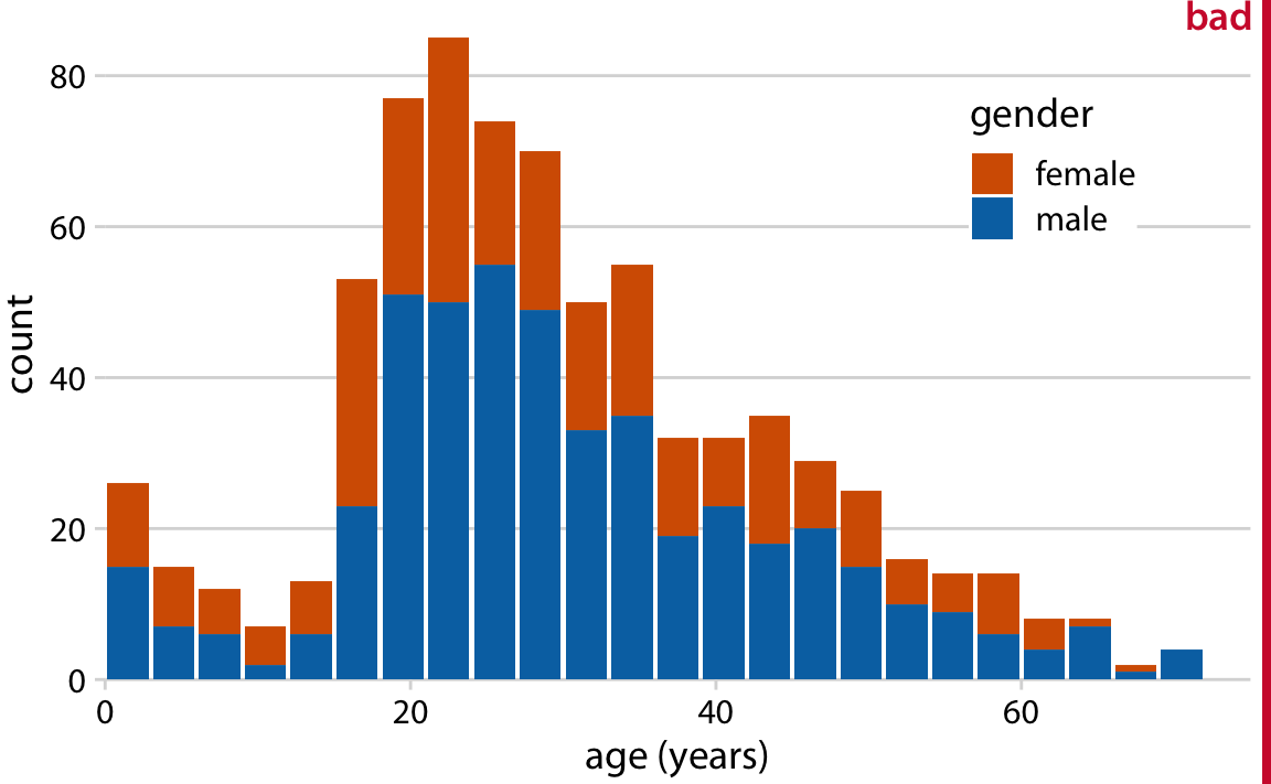
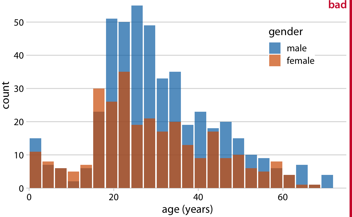
Stacked histograms do not preserve the shape of distributions (except whichever one is on the bottom).
Overlaid histograms are visually messy due to color blending.
Multiple histograms
Here’s a creative solution, but one that will only work for comparing two distributions.
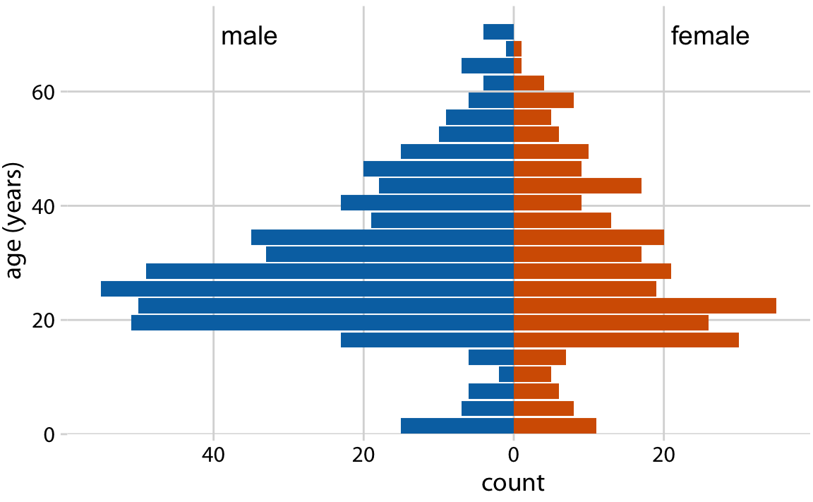
Alternatives to multiple histograms
Density plots are better alternatives to stacked histograms for a small-ish number of distributions.

Overlapping densities
Visualizing many distributions
Ridge plots are good options for comparing a large number of distributions at once.
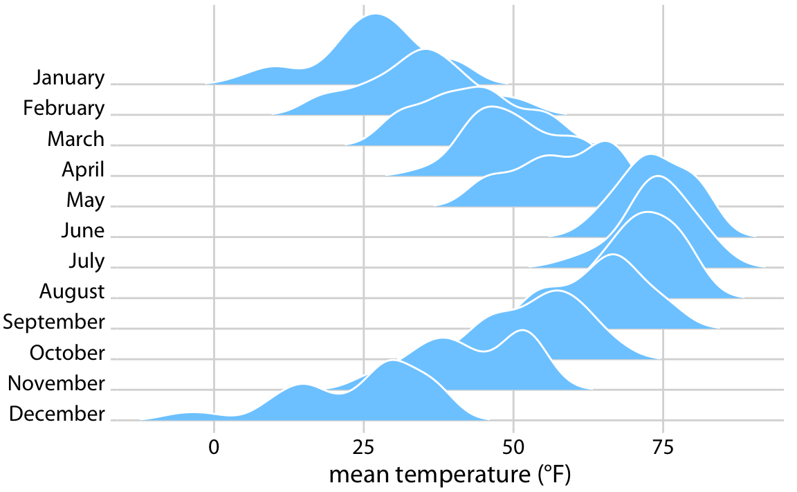
Ridge plot: temperatures in Nebraska in 2016.
Visualizing many distributions
Ridge plots are good options for comparing a large number of distributions at once.
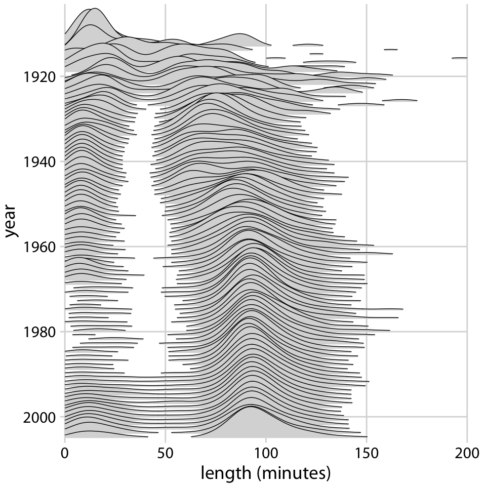
Another ridge plot: movie lengths by year.
Two-variable graphics
Two-variable graphics are all about displaying relationships, usually with scatter or lines.

Scatterplots
Scatterplots display relationships between two variables.
Code
alt.Chart(
    lifegdp.loc[2015]
).mark_point().encode(
    x = alt.X('GDP per capita', scale = alt.Scale(type = 'log')),
    y = alt.Y('All', scale = alt.Scale(zero = False),
    title = 'Life expectancy at birth')
).properties(
    width = 600
).configure_axis(
    labelFontSize = 16, titleFontSize = 16
).configure_legend(
    labelFontSize = 16, titleFontSize = 16
).configure_title(
    fontSize = 16
)
You’ll make extensive use of scatter and bubble plots for displaying this relationship in lab 4.
Alternatives to bar plots
Bar plots usually depict amount or magnitude.
Alternatives to bar plots
There is almost always a better alternative to a bar chart
With reference to the last example, which are we more interested in:
- Population growth by region?
- Regional share of global population?
As an aside, this depends on what story the plot is intended to tell and how it fits into the broader data analysis.
Alternatives to bar plots
If it’s population growth by region, the line plot from earlier is cleaner.
Code
alt.Chart(
    popregion
).mark_line(
).encode(
    x = 'Year:T',
    y = alt.Y('Population', scale = alt.Scale(type = 'log')), # change axis scale
    color = 'Region'
).properties(
    width = 400, height = 300
).configure_axis(
    labelFontSize = 16, titleFontSize = 16
).configure_legend(
    labelFontSize = 16, titleFontSize = 16
)
Alternatives to bar plots
If it’s the relative share of the globabl population in each region over time, an area chart is cleaner.
Code
alt.Chart(
    popregion
).mark_area(
).encode(
    x = "Year:T",
    y = alt.Y("Population:Q",
        stack = "normalize",
        scale = alt.Scale(type = 'sqrt'),
        title = "Proportion of global population"),
    color = "Region:N"
).properties(
    width = 600
).configure_axis(
    labelFontSize = 16, titleFontSize = 16
).configure_legend(
    labelFontSize = 16, titleFontSize = 16
).configure_title(
    fontSize = 16
)
But if you insist on bars…
… there are some rules of thumb to keep in mind for bar plots:
- orient axes so labels are legible
- don’t stack; use side-by-side bars instead
- start bars at zero, so that their height is proportional to the quantity of interest
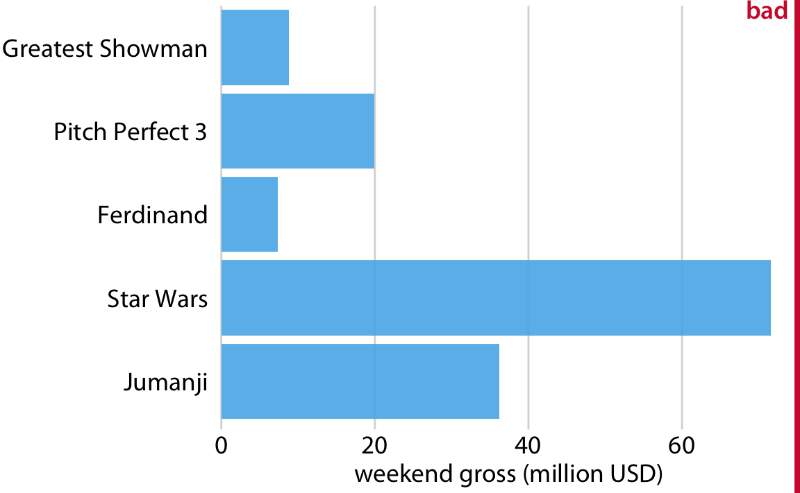
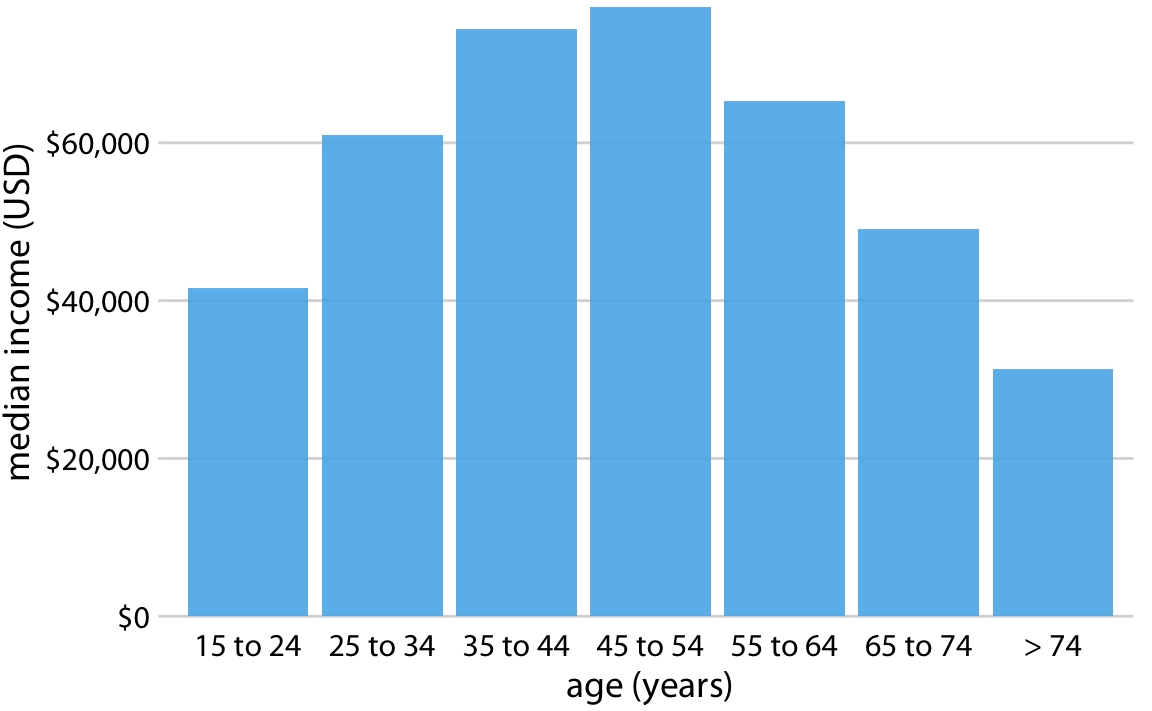
- arrange bar order sensibly; if the categories are ordered, arrange by order, and otherwise, sort by bar height
Axis orientation for barplots
If you have to tilt your head, there’s a better orientation available.
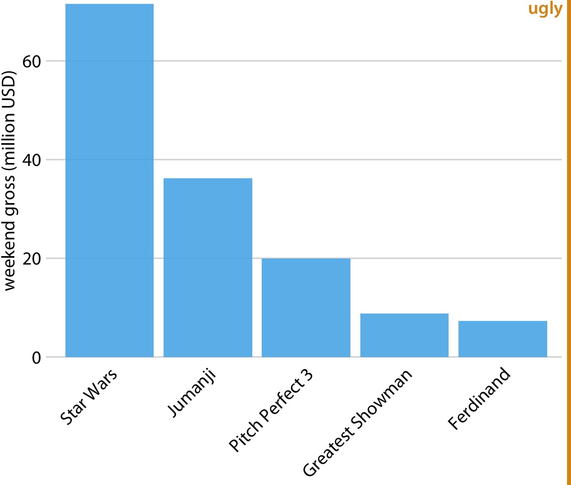
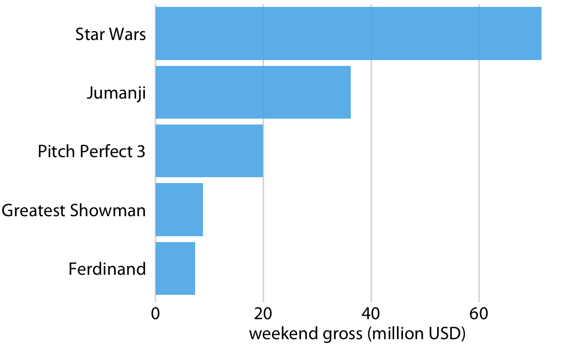
Ordering of bars
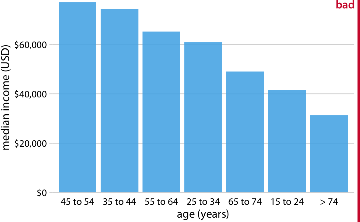
For categorical bar plots, order bars by height.

Ordering of bars
But don’t order by height if the categories themselves are ordered.
Group don’t stack
Stacked bars are not an effective means of comparing distributions – group and use side-by-side bars instead.
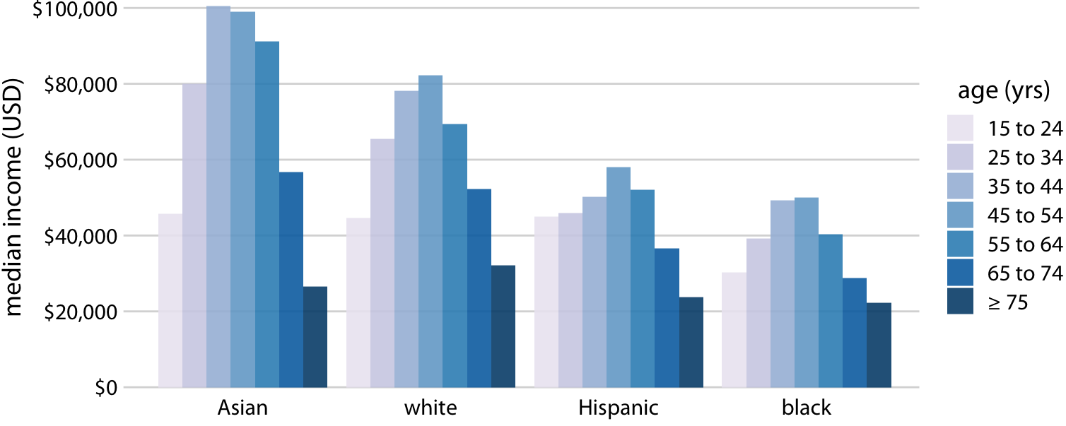
Grouped bar plot
Always start at zero
Bar height should be proportional to the quantity of interest.
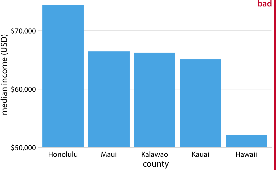
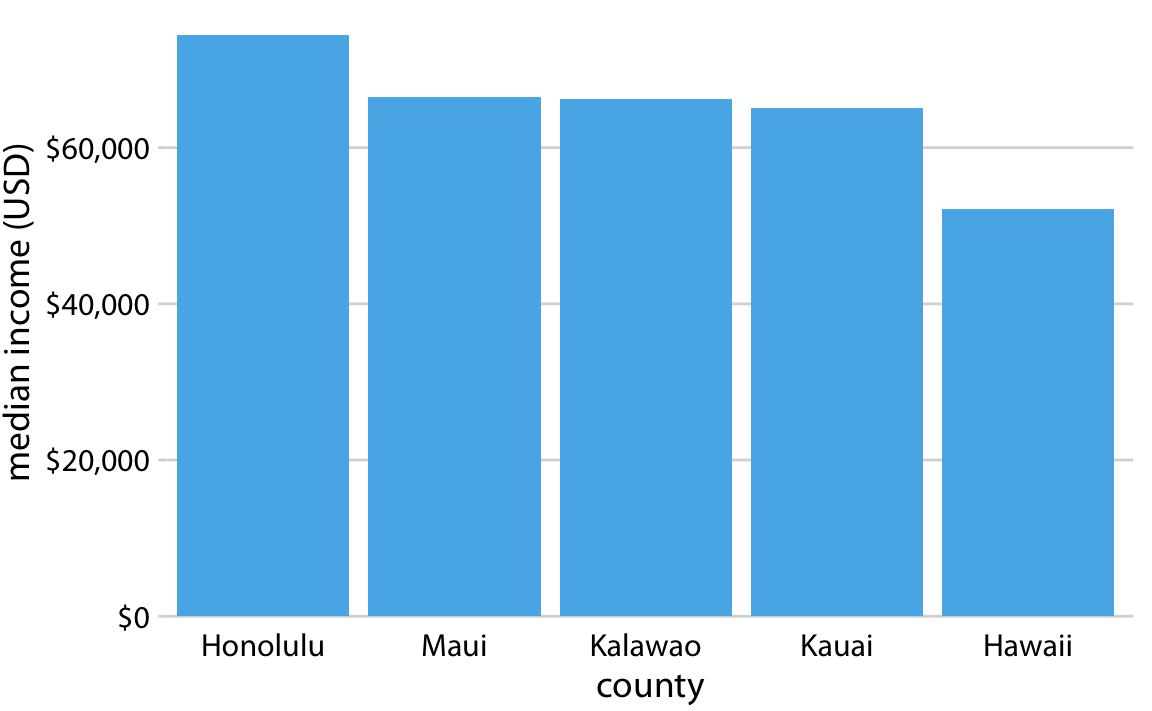
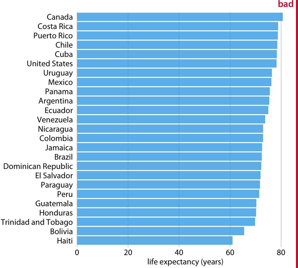
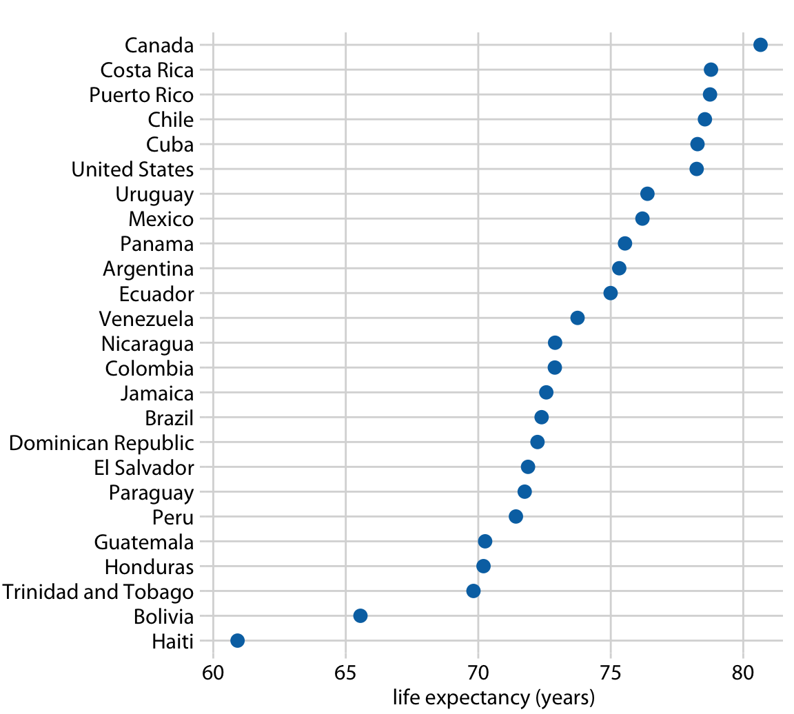
But don’t take up all the space
If your bars occupy almost the entire plot, there’s probably a better alternative. Try dots.
Other common visuzlizations
Smoothing scatterplots helps to visualize trends. Next week we’ll discuss this in detail.
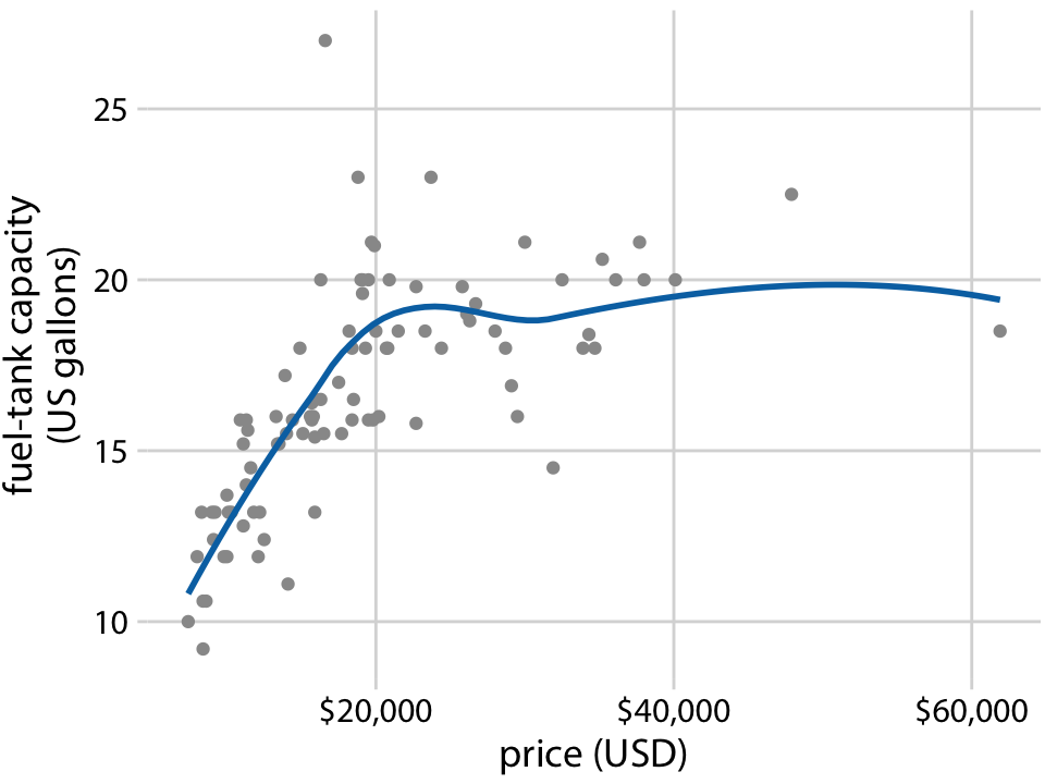
Scatterplot smoothing
Other common visualizations
Heatmaps are a common choice for displaying amounts in two-way groupings or for visualizing matrices.
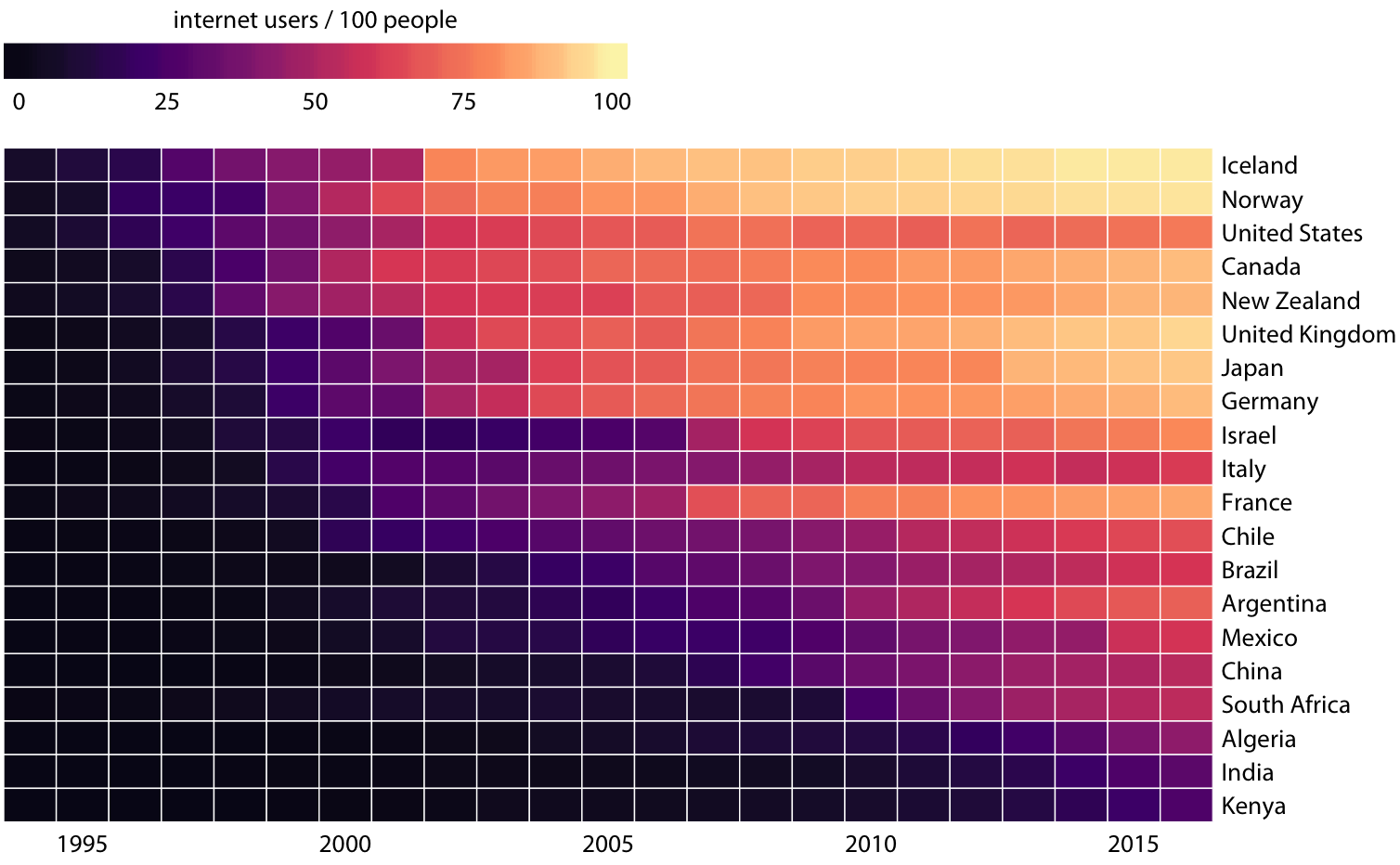
Heatmap
Small but important choices
How to order the countries? Depends on what feature you wish to emphasize.
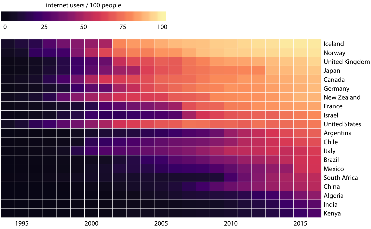
Countries reordered by internet use in 2016.
Are you more interested in present internet use, or early/late adoption?
Other common visualizations
Chloropleth maps are the most common display of spatial data.
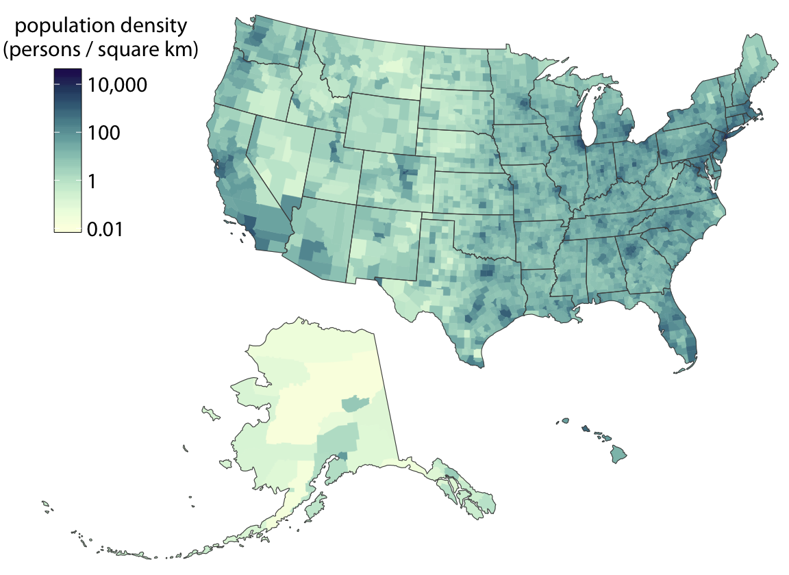
Chloropleth map
What makes visualizations effective?
Novel. Novel visuals don’t need to elicit superlative reactions, but they should (if only subtly) surprise and spark interest to some extent.
Informative. Informative visuals make information apparent. In a way they are unambiguous.
Efficient. Efficient visuals have an accessible message. They use space economically but without becoming overly complicated.
Pleasant. Visuals should be nice to look at!
Next time we’ll discuss principles of visualizaiton