Figure design
Invalid Date
Qualitative scales
Qualitative scales are non-monotonic sets of colors.
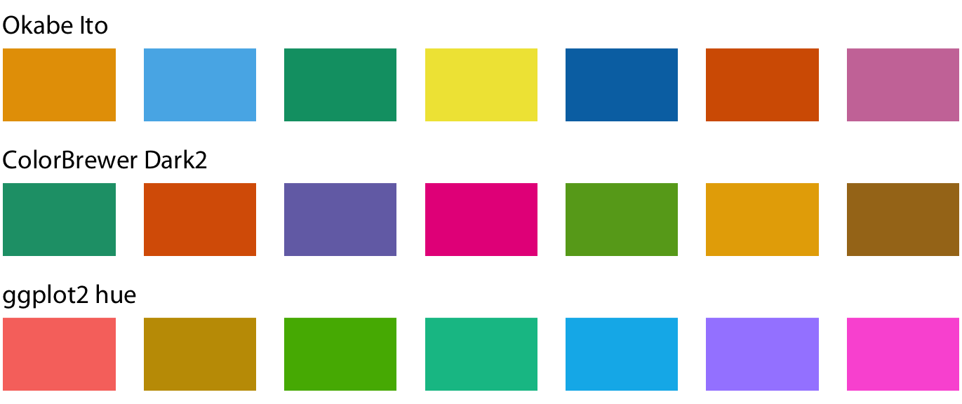
Useful for displaying categorical variables with few levels.
Sequential scales
Sequential scales are monotonic sets of colors spanning a color gradient.
Useful for continuous variables.
Sequential scales
Example sequential color scale
Diverging scales
Diverging scales are sequential scales centered at a neutral color.
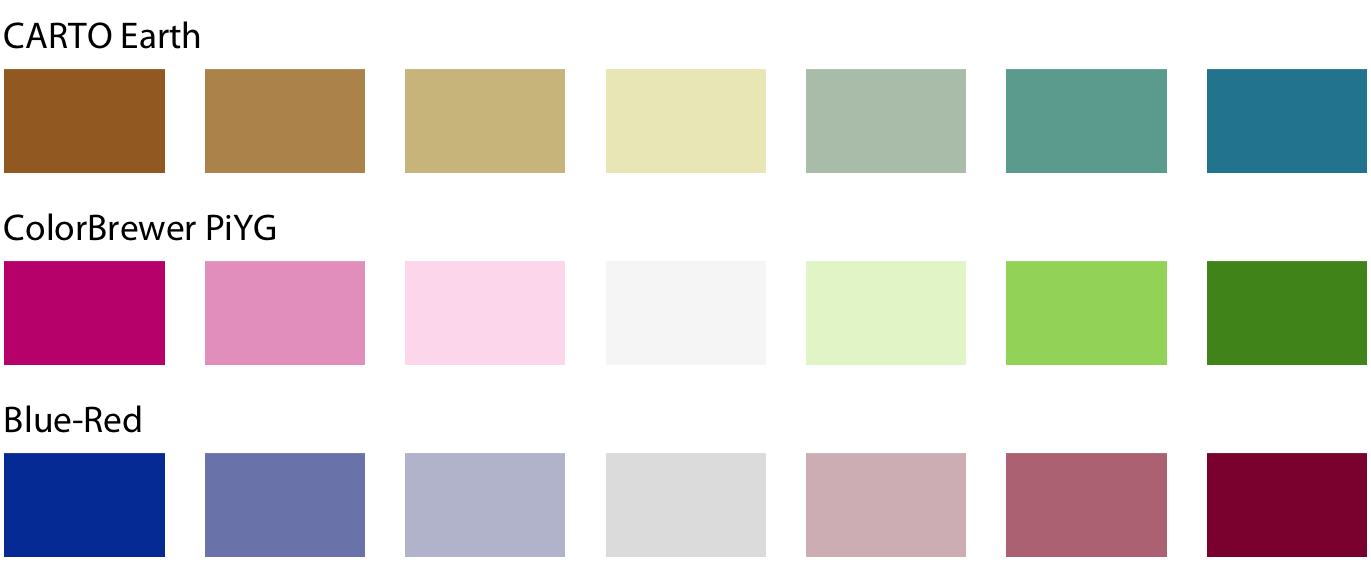
Useful for continuous variables with a ‘natural’ center.
Diverging scales
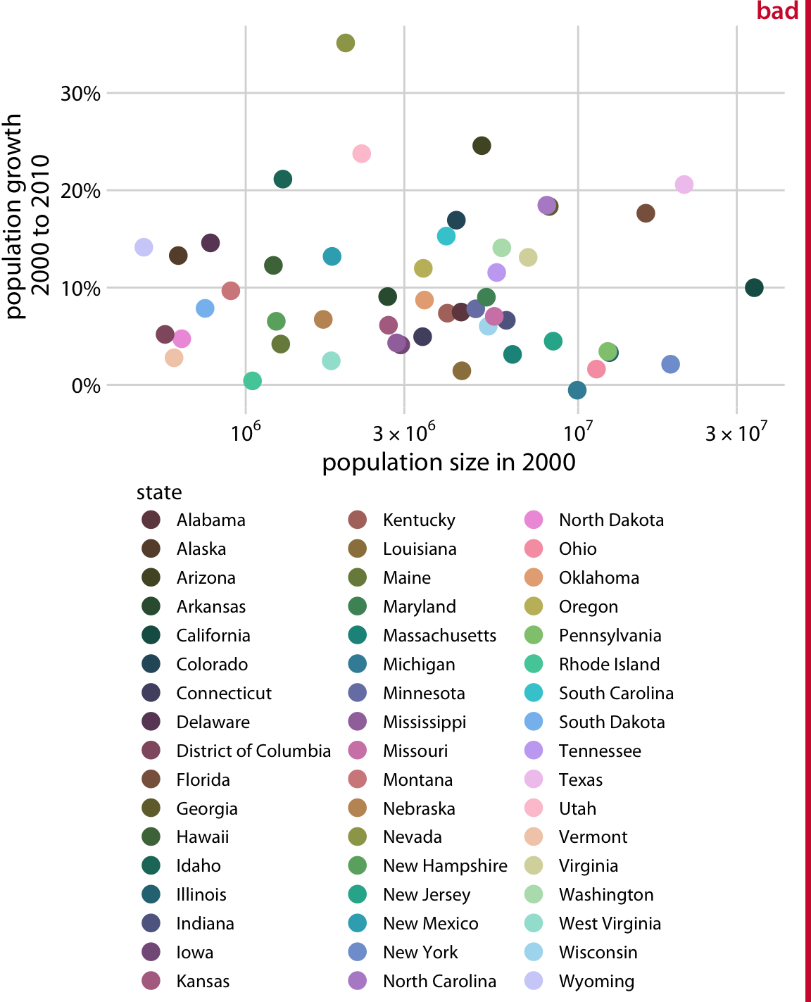
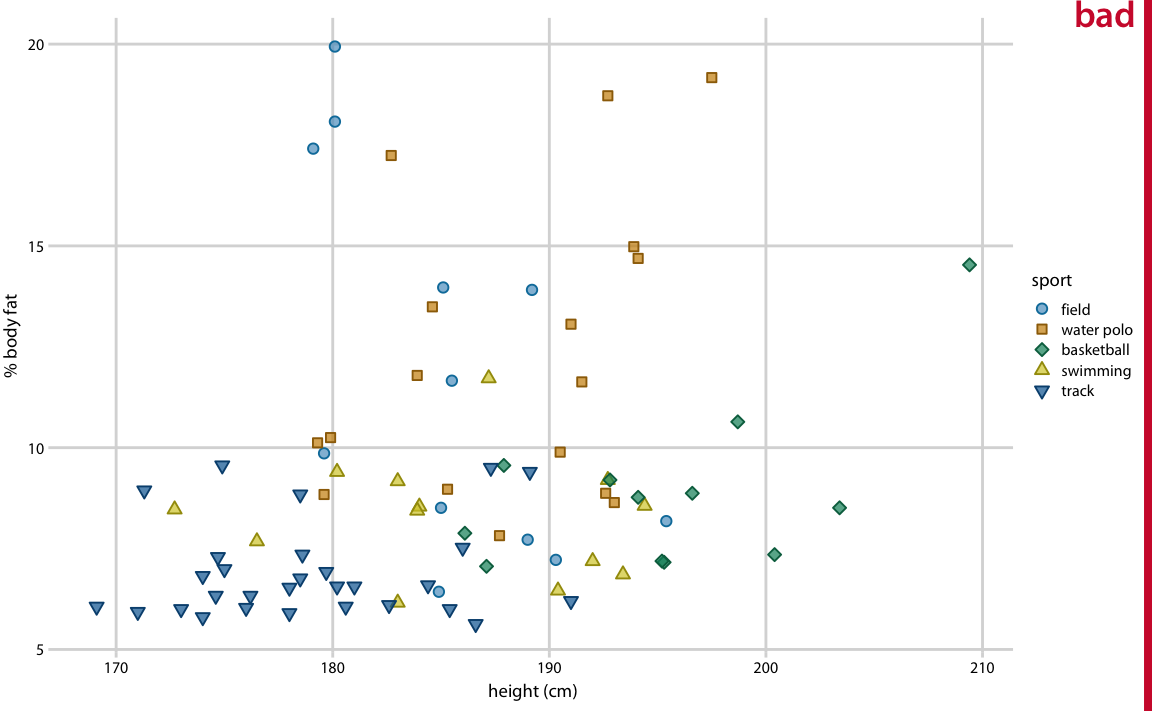
TMI
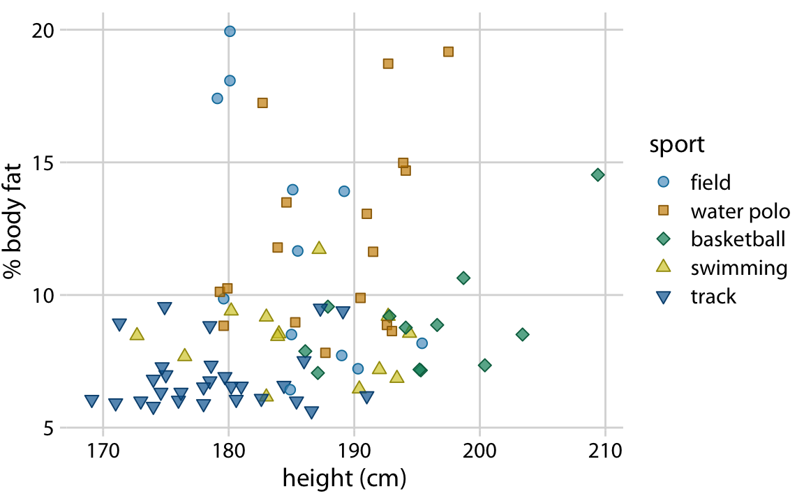
Better
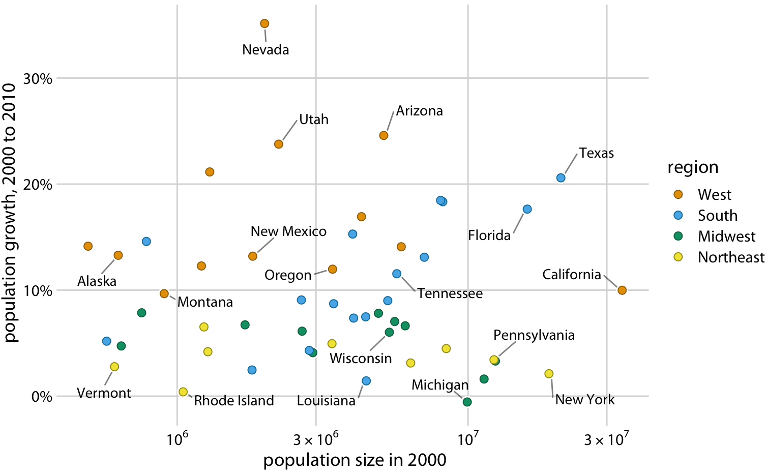
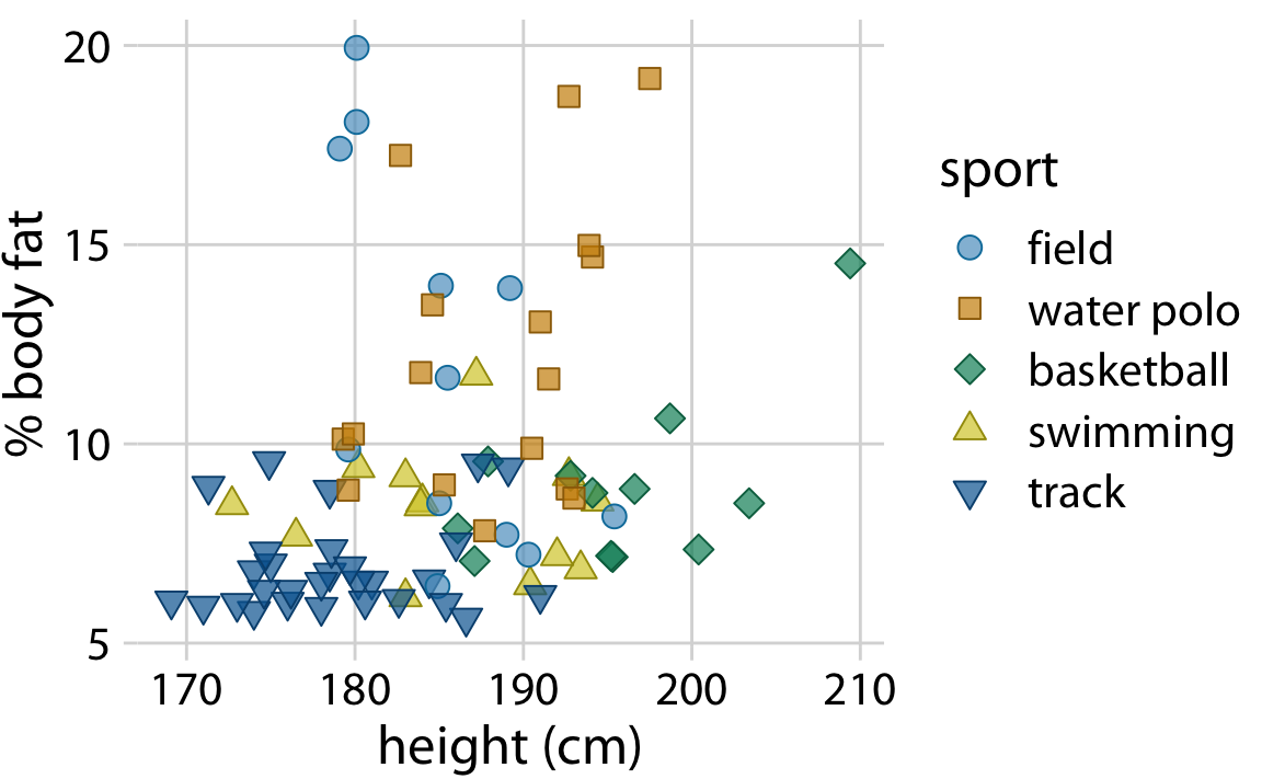
Avoid encoding more than 5 categories using color
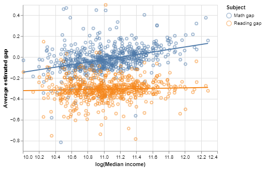
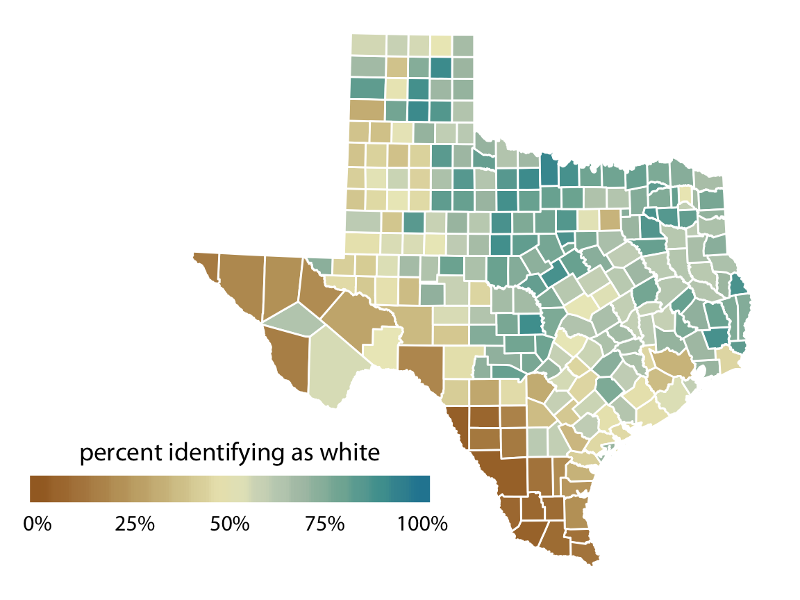
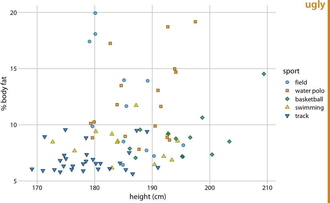
Inappropriate scales
The color scale doesn’t match the data well, since the rainbow scale emphasizes arbitrary data values. In addition, colors here are too intense.
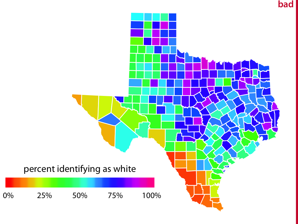
Better
A diverging scale is appropriate here because 50% is a natural midpoint in context.
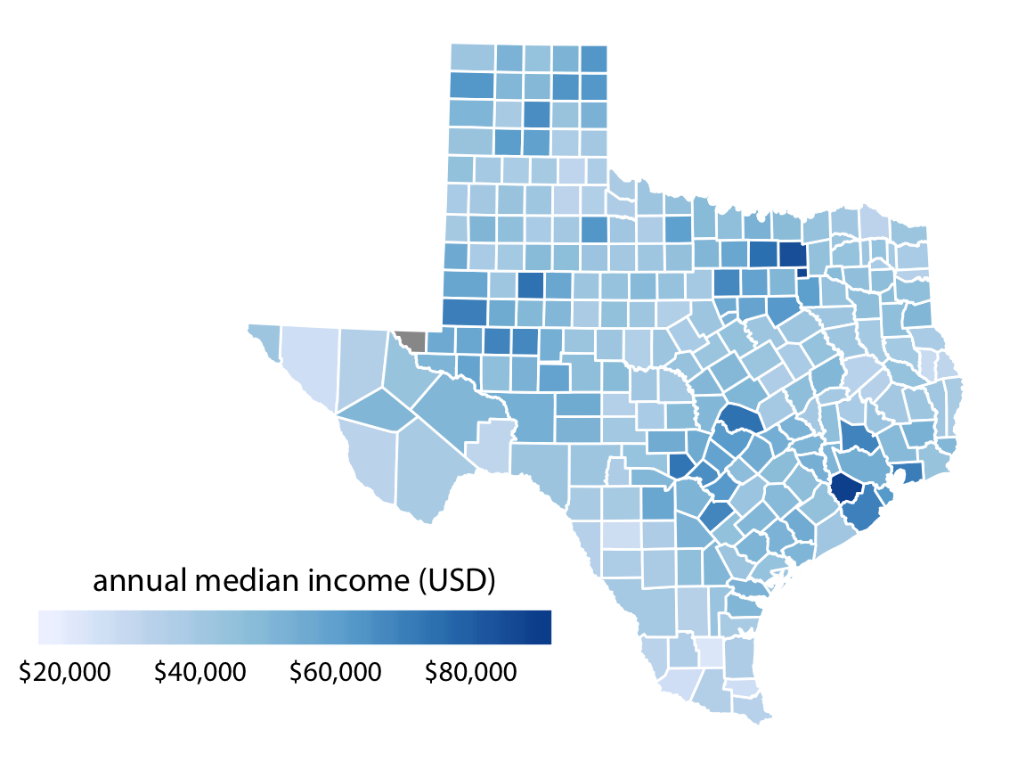
CVD-friendly scales
Some color scales still retain visible contrast for different types of color vision deficiency (CVD).
Here is a simulation (for those without CVD).
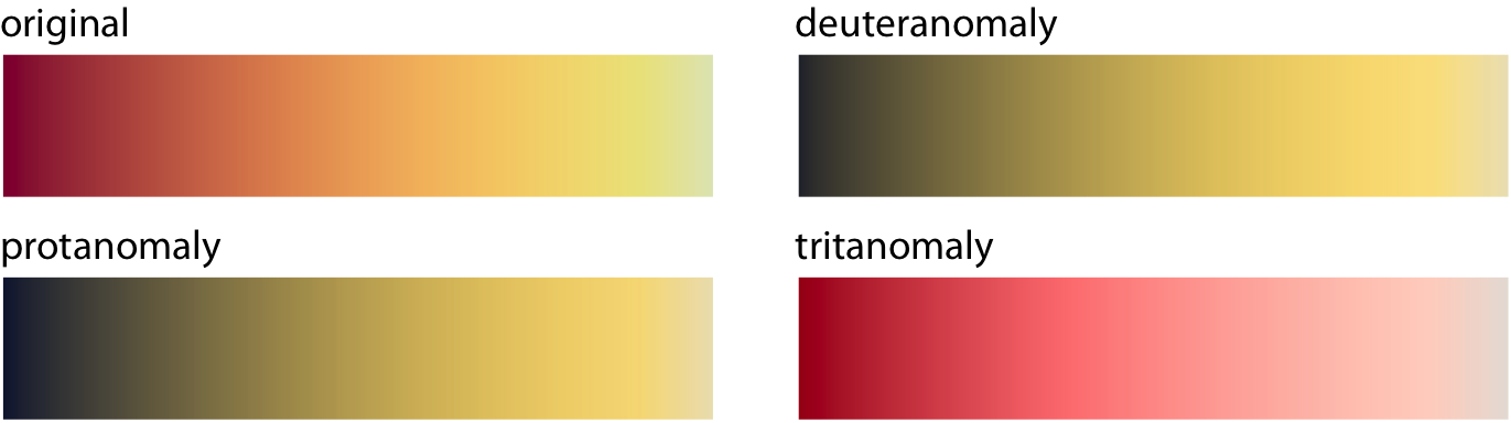
Color scale shown for different types of colorblindness using CVD simulator
CVD-unfriendly scales
Other scales get muddled.
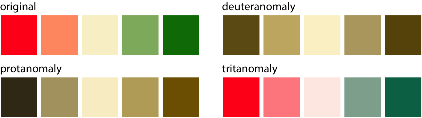
When in doubt, use a CVD simulator to check figures
Another approach: redundancy
When possible, use ‘redundant coding’ – map the same variable to color and one other aesthetic.
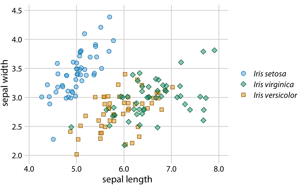
Faceting
You’ve already made a faceted plot.
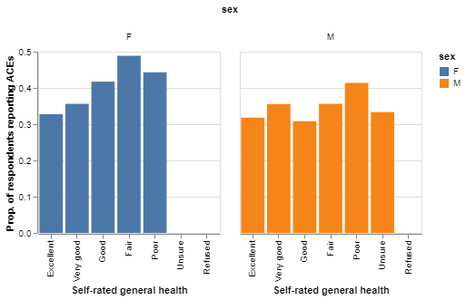
Notice the redundant use of color!
Many facets
Often a big panel of scatterplots can be a useful exploratory graphic.
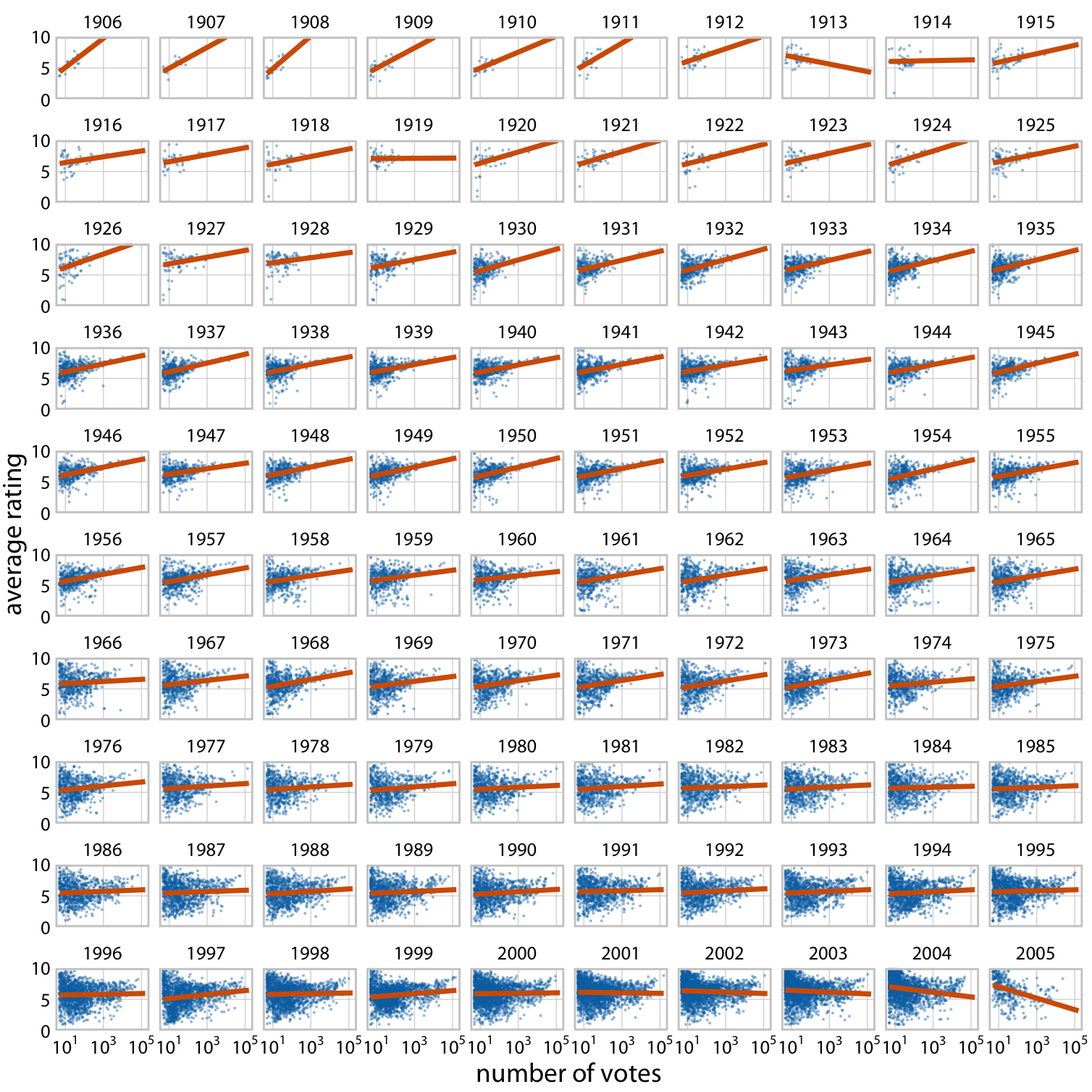
The figure shows a lot:
- Timespan of data 1906-2005
- More observations (movies) in later years
- Higher vote counts in later years
- Higher rating variance among movies with fewer votes
- Long term reversal of voting/rating trend
Use fixed axis scales
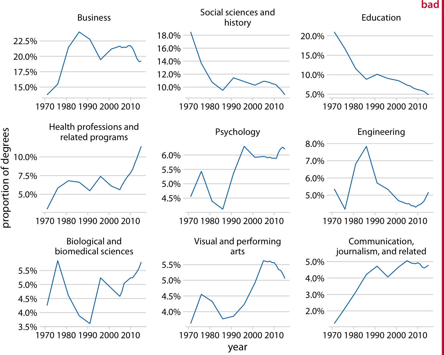
Example of facets with different y axes
Suggests, misleadingly, that Education declined by the same amount as social science and history.
Use fixed axis scales
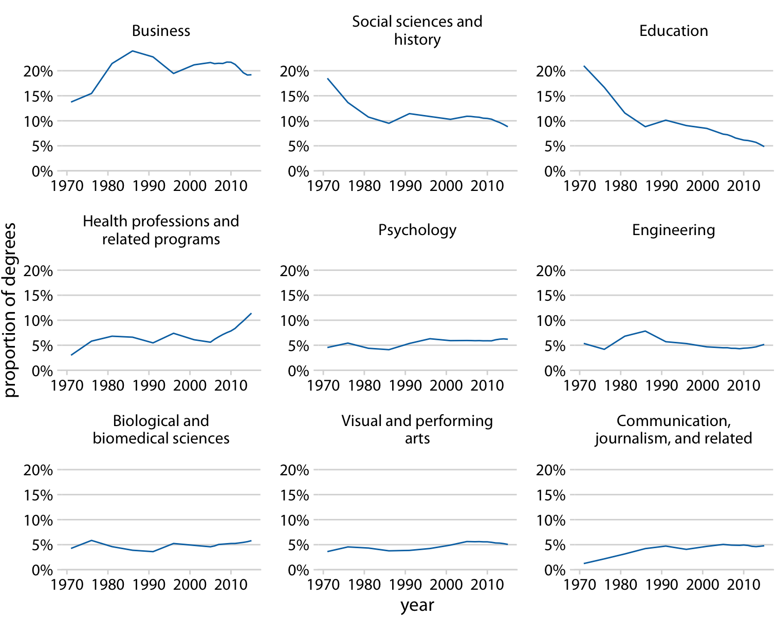
Same as before, with common fixed axis scales.
What about this?
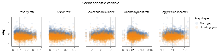
One axis is fixed, one is free.
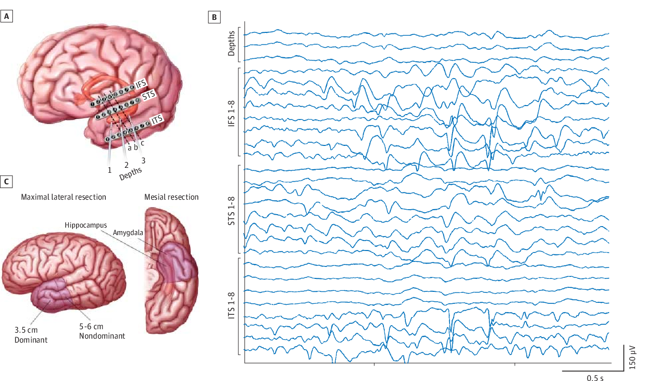
A figure from HW2
The variable of interest, Gap, is still comparable across facets. So only one axis needs to be fixed.
What would it look like if all axis scales were fixed? Would comparisons be easier or harder?
Sizing
Usually figure defaults look fine on your IDE but render too small when graphics are exported.
These will be illegible in slide presentations, reports, etc.
Sizing
These labels are legible, but still too small – they take up a minimum of space in the figure.
Unbalanced text/graphic/whitespace
Sizing
Use larger labels than you think you’ll need.
Balanced
Note also the mark size is increased a bit.
Sizing
Don’t overdo it.
Unbalanced again
Sizing
If the figure will be reproduced in a scaled-down size, increase all sizes in proportion.
Critiques
Series from NYC Life Expectancy Dropped 4.6 Years in 2020
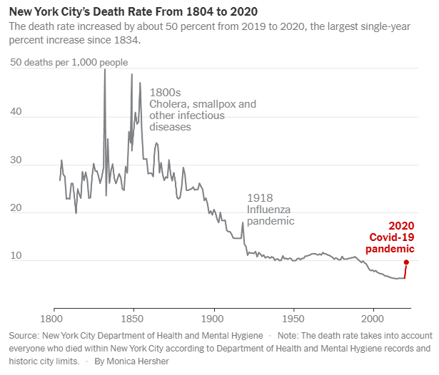
Positive:
- effective use of labels
- effective use of highlighting
- well-proportioned
- clean axes
Negative:
- COVID spike looks minimal, contrary to story?
- the most striking feature of the plot is the time trend and variance stabilization
Critiques
Series from NYC Life Expectancy Dropped 4.6 Years in 2020
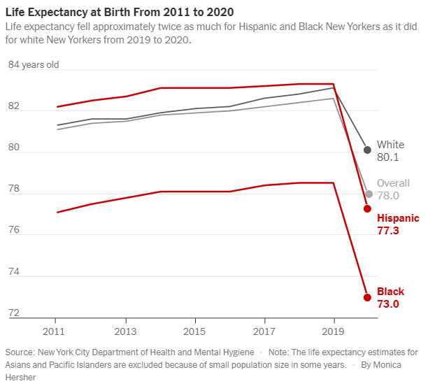
Positive:
- same as before
Negative:
- doesn’t convey proportional change in decrease efficiently, but that’s what the caption emphasizes
- ‘overall’ looks like a fourth group
Critiques
Series from NYC Life Expectancy Dropped 4.6 Years in 2020
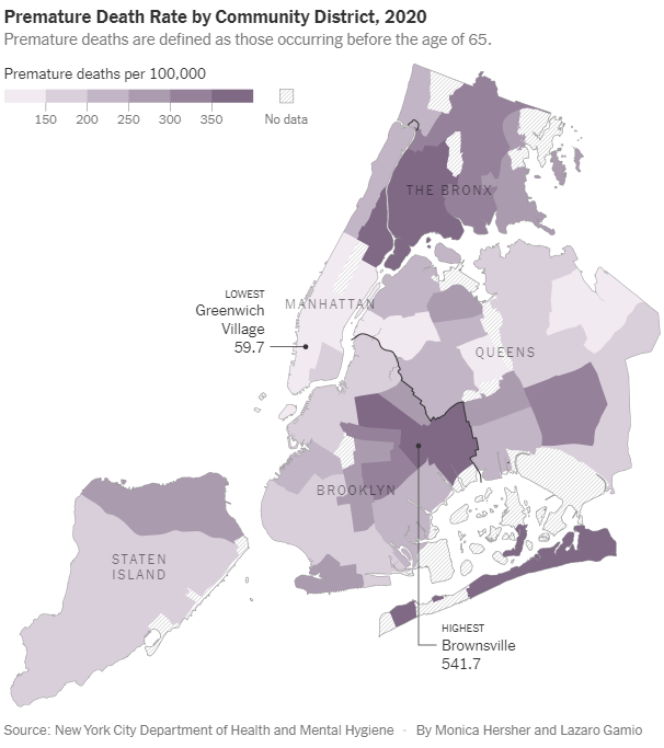
Positive:
- exemplary use of color scale/palette
- line shading shows missing data clearly
- effective use of labels
Negative:
- no clear story
- lacking a baseline comparison
Critiques
Series from NYC Life Expectancy Dropped 4.6 Years in 2020
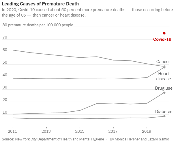
Positive:
- clear story
Negative:
- awkward/distracting to include time, since no history for COVID
- not the most efficient display of the captioned message
Remark:
- it would be more interesting to see the time courses after 2020
More critiques
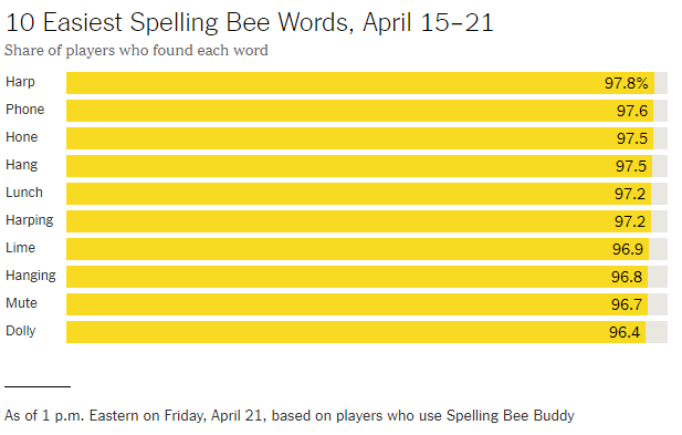
Positive:
- clear labels
- unambiguous
Negative:
- bars take up all of the plot here
- many words seem equivalent
Suggestions:
- find an alternative to the bar plot
- consider emphasizing comparisons between word clusters rather than individual words
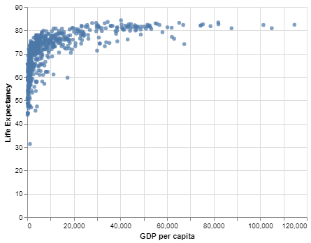
An untidy plot
The starting plot in lab 3 is actually a bad plot because all years are shown together – so observationational units (countries) are not clearly distinguished.
A tidy plot
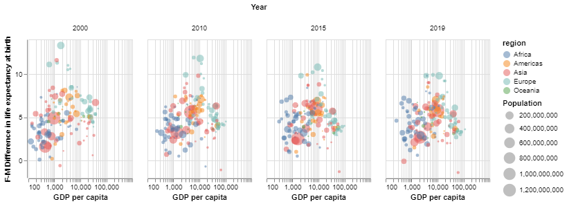
This is tidy, because within facets:
- each bubble represents a country
- any two bubbles represent distinct countries
Practice
Practice
Practice